Thinking of how I can fully optimize the material of magnesium by means of Fused Deposition Modelling, I came up with the concept that: although magnesium was discovered in the 1600s, isolated during the 1700s and utilized for military applications during the World Wars, the period in between - which was the Industrial Revolution - was wasted. So I wanted to recontextualize that period to prove what could have had been a great utility of magnesium.
Hence I sought for some William Morris / Victorian pattern designs for my chair...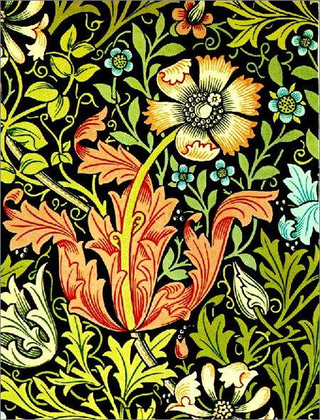


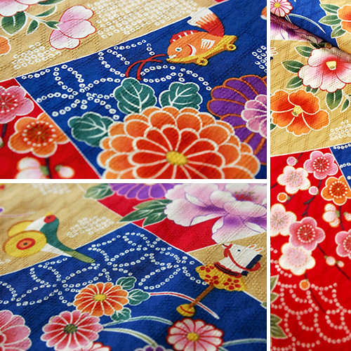
Then remembering from the exhibitions I went to, at that time traditional Japanese art also had some oriental influences on the western arts & crafts...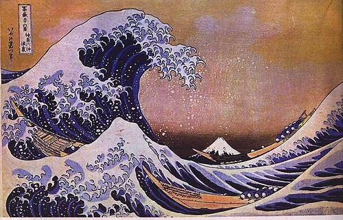

Tuesday, September 30, 2008
The World of Patterns
Some 3D Printed Models
Looked through a variety of rapidly prototyped chairs to seek some inspirations... 


Most of the designs shown can be found from http://www.oobject.com/category/3d-printed-products/
Friday, September 19, 2008
There's Something About Maggy
Last week we presented our initial concepts for our second project: Material World.
Our material selection was Magnesium. At first we were like 'o no...' because it sounded like such an unfamiliar material to us. But after some decent research into it, we realized how important it is to us, and how unique it is as an earth metal:
- It's the 3rd most commonly used metal after steel and aluminium.
- Has high strength-to-weight ratio (lighter than most metals without losing strength)
- Low melting point; ignites in contact with air / water
- Corrosive in nature
- High viscosity (good surface features)
Just a few of these characteristics is enough to convince engineers of its utility; it has been applied mostly in automotive and aerospace industries where lightweight contributes a great deal to energy efficiency.
Anyhow, my proposed approach to magnesium is to bring it back into the domestic environment where common users can really start to acknowledge of its existance and significance in our everyday lives - to establish an intimate relationship on a physical and emotional level. Here are my 4 concepts (p.s. I don't know how the image converted to blue from orange after I uploaded them) :

DESIGN RATIONALE: utilizing Mg propoerties, a coffee chair is made out of sheet metal produced by the Twin-Roll process patented by the CSIRO (only feasible with the versatility of Mg; up to 3mm thin). The form takes the curvature of a saltwater fish (where plentiful of Mg is found) to reconnect it back to its history.
CLIENT RESPONSE: How is the sheet metal going to be bent after it's rolled? How can properties of Mg be taken further?
 RATIONALE: Take the automotive form and bring it back into the home. Can be mounted onto wall so the function of the wheel still exists. First attempt for Mg to be manufactured using Fused Deposition Modelling (which is suitable for eutectic metals i.e. easily melted).
CLIENT RESPONSE: the form looks moulded / could be more exquisite in detail so that it appears to be ONLY for Mg and ONLY for FDM prototyping. But even beautifully detailed, will it still be able to hold the weight of 8+ wine bottles?
 RATIONALE (really is supposed to be orange colour): Taking the mickey out of the fact that Mg can be found in fruits and vegetables, I came up with a thixomoulded rocking chair that's portable and can also function as a storage. The seating area is in fact knitted out of elastic material which can ergonomically accommodate to the seater's physique.
CLIENT RESPONSE: Interesting connotation; but perhaps the Mg properties can be driven further to really show its uniqueness. Perhaps a porous casing?
 RATIONALE: Once again, to play on the fact that Mg can be found in (yes) chicken eggs AND the fact that Mg Oxide is used to coat heating elements. An organic form is conceptualized in full Mg casing (coated in silicone for cold insulation) and allows less user fatigue when pouring.
CLIENT RESPONSE: Why Mg? It can also be in other materials ... in other words this concept doesn't utilize Mg properties to a full extent.
**********
In conclusion, I think I have decided to develop further with the chairs and really look into the manufacturing processes that maximize magnesium's performance characteristics. Off to do some reallll thinking now...
Click Here to Read More..
Friday, September 12, 2008
Exhibition Review 1
I think it's about time I should post up some of the photos I took at the exhibitions I went to.
First one was the Australian International Design Awards 2008 Exhibition; I visited this one simply because it was the first thing I saw after getting confused at where to go.
 The criteria for the award was based on: innovation, functionality, visual appeal, quality, environmental impact, ease of use, and safety. I think fulfilling the purpose of all the above mentioned would definitely have to be something truly amazing.
 Well, after thinking that I turned to the first section of display: a green-mold chair, a helmet, and a water bucket. At first I was like 'hmmmm' but then I realized these were designs from the PAST. Reading more into the descriptions I began to understand the functionality and how it made its mark in history on revolutionizing what was even more obsolete. I think with ordinary objects like these, people don't really learn to appreciate its existence and the convenience in life they bring; let alone the intellect behind its making. Just looking at how a simple form changes the entire impact of the solution is profound - from the ground-breaking surf fins by Metro Solutions to the EFTPOS device by Ingenico International convinced me of their eligible presence behind the glass panes.
Next I moved towards the back of the exhibition. It was the PowerHouse Museum Selection 2008. The designs on display ranged from eco-friendly windows to newly improved LEDs; some were designed by design graduates. I think this part of the exhibition is on the time of NOW - in the sense that we are now at a stage where sustainability is the new word that's pushing the frontier of design possibilites. The Lightway Window by Damian Savio uses transparent photovoltaic cells which powers OLEDs at night and can be deployed to use as a portable lamp; as seen below:

Then there were the innovations by students boxed in the next few displays. So far the exhibition flows clockwise starting from the entrance in chronological order, which I think has its own meaning of time travel. Anyway, the following displays showed some interesting technological innovations that improve the benefits of users, e.g. the Flaik personal tracking device for skiers and snowboarders created by CMD Product Design. This piece of electronic allows interactive data that digitally records and synchronizes the skier's performance & snow experience which can be shared on a web portal. This is the winner of the AIDA Top Accolade prize. Shown in front is a series of concept drawings of the design - I was amazed at the resolution! I think the professionalism in the pencil work is out of question; likewise the rest of the designs all showed a panel of the concept generation behind the final product, and I think it showed to some extent the respect to the designers and how they manifested the quality and integrity into their own works of avant garde. This was a good intention of the exhibition I thought, providing a good insight into the design process to educate and inspire viewers of all ages.


Finally I reached around the corner to find some FUTURISTIC designs - one dominant model was the Sunswift solar car designed by the UNSW Solar Racing Team! :D
I am not being biased but I don't really like how it's displayed in a corner - facing the back! Even though it's got a 1:6 model encased, a video coverage, 2 - 3 description boards plus a hero shot photograph - all this seemed kinda pointless when it's really not located at the pride of place! I guess solar cars ain't something promising five years down the track yet...

Coming out of the corner I came face to face a final set of displays on construction development. Something I am not that interested in but still took a quick skim through it. I stopped to take a closer look at the architectural model that was so refined in detail. It's really beautiful by itself; I don't think I can ever have the hands to make such intricate objects! (yes, I have a lot to improve in terms of my model-making skills...) Here are some photos of it:


I am not quite sure but I think this last section rounds up the exhibition in the sense that it's protecting the past. The architectural model is actually a physical demonstration of the Mosaic Wall Preservation Project (President's Award in the Engineering Division); I mean it's a different approach to environmental design, but I think on a conceptual level of the exhibition it means that although we are moving forward we should always take a moment to look back and value the milestones that made us who we are today. This, also completes the circulation of the exhibition, connecting back to the starting point - the displays of the past.
Overall I quite enjoyed this exhibition even though it was rather short. But I think it made me think a lot in terms of value on a variety of levels. Hopefully I have described the virtual tour well!!

More to come: INSPIRED! Exhibition
Click Here to Read More..
Monday, September 8, 2008
Great Minds Think Alike!
It's funny cos, was just browsing the Yanko Design Blog .. and found that Sungwoo Park & Bongkun Shin came up with a concept that is similar to mine! Except their concept layout is way more professional haha :p
The blog editor pointed a question out though: "Many modern cards utilize texture in the design which a screen doesn’t pick up. Many also use front/back layouts which this concept doesn’t seem to address." I think this proposed some interesting improvements that could be further developed - perhaps in the future they'd have OLED screens that are texturally tactile!! That would be qool.
Anys, here are some of their graphic presentations:
Really nice CAD modeeling, very clear and distinct layout of the design object too.
 Nice photoshop rendering - but I just thought they should have at least hired a better looking pair of hands... or at least put some moisturizer on!!
 This is really professional - the exploded axometric perspective of the design. I also like how they have inserted a search scroll - even though I don't really know how they are going to navigate through the interface if it ain't touch creen (and obviously you can't see any other buttons apart from the mode button); then again, their device is simpler in terms of the software. I just thought, if they were going to enter these contact details into their laptops, they'd have to type it in themselves - whereas what I had in mind was that it could be transferred digitally by means of a USB port.
One more thing though, their scanner is incredibly thin!! This nanotechnology surely won't be happening for another 5 years down the track? Who knows!
Nonetheless, I like their search interface though - very 'Apple', haha!
By the way, Yanko posted this on the 8th September 2008 - just to clarify that I didn't steal their idea!
More images from http://www.yankodesign.com/2008/09/08/digitize-that-stack-of-business-cards/
Click Here to Read More..
Post-project Review
It's been almost a fortnight since we presented for our first assignment. Been wanting to do a review as a reminder of the things that I need improvement in as well as a reference for me to come back to when I work on my future projects. 

These are just some hero shots I took at home with my poor resolution camera phone.

This is how my presentation looks like. And the follwing is the final concept board:

Like Oya said, I missed a few details such as accommodating to different positions of the USB port in the device, the button cross-section in the CAD drawing, and LED indication on the model.
I did actually consider the LED part while I was making the model... but it was silly of me to have not printed out a CAD which I could follow - obviously trying to squeeze everything in my mind is not the most secure method - so ya, I missed that part out after spraying and adhering everything together.
In terms of the general assembly drawing, Oya suggested to include ultra-zoom-ins of the cross section details of - yes - the buttons. Funny that I was more anxious about the LED part of the CAD that I forgot about how the buttons are put together! Man!
Anyway, hopefully I will try to cover all technical / ergonomic / graphical / material specifications of my next design.
In the end I'd like to show the other 2 designs from the same GEN X MEN group:
 The eCook by Fendi

The SwingAid by Monica
Click Here to Read More..
Subscribe to:
Posts (Atom)


